- Work
- Mapped Asia Branding
Mapped Asia Branding
Mapped Asia Branding
Studio Giraffe created a logo, colour palette, imagery style and guidelines for Mapped Asia, an online mentorship and recruitment platform.
Studio Giraffe created a logo, colour palette, imagery style and guidelines for Mapped Asia, an online mentorship and recruitment platform.
OVERVIEW
SCOPE
Creation of a logo and colour palette
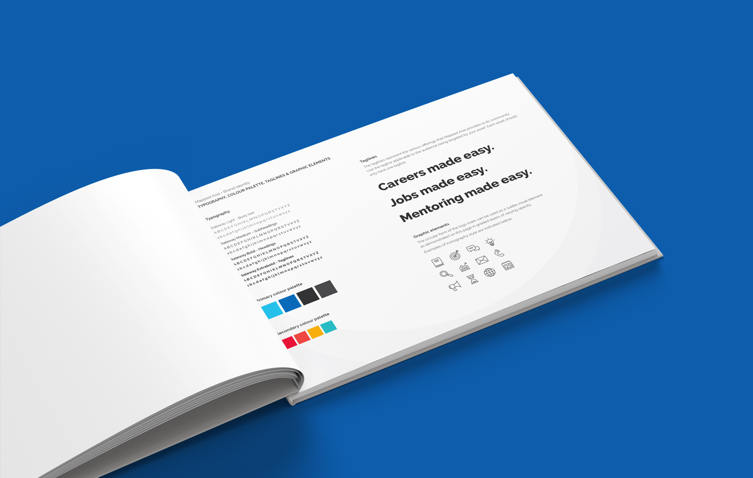
Typography selection
Imagery style
OBJECTIVES
Create a brand that is approachable, flexible and friendly while retaining a sense of professionalism and reliability.
SOLUTION
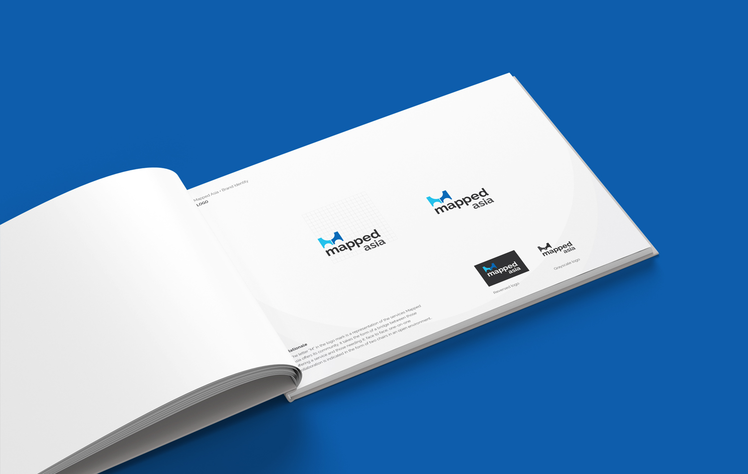
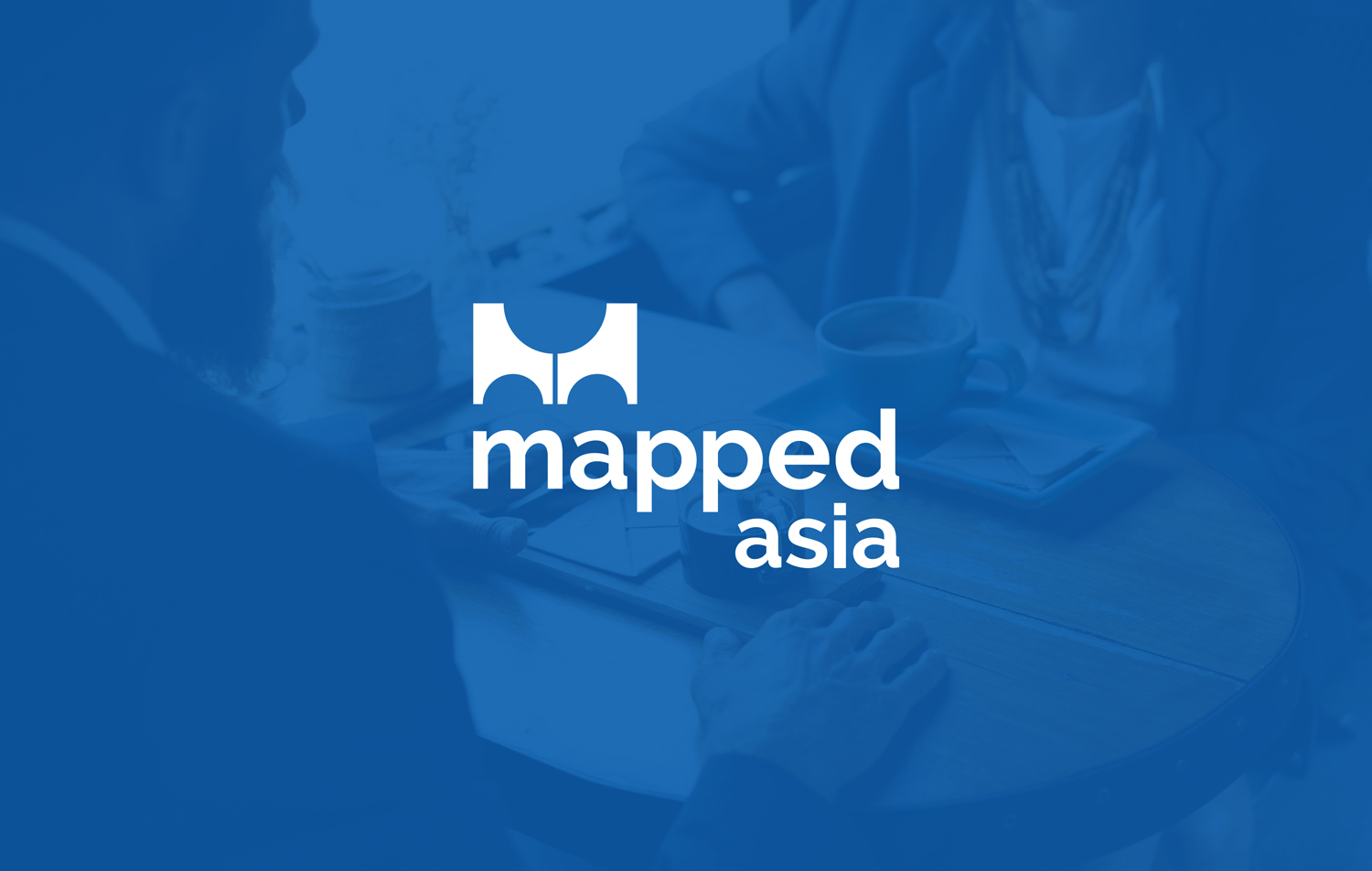
The letter “M” in the logomark is a representation of the services Mapped Asia offers its community and takes the form of a bridge between those offering a service and those needing it; face to face one-on-one collaboration is indicated in the form of two chairs in an open environment.
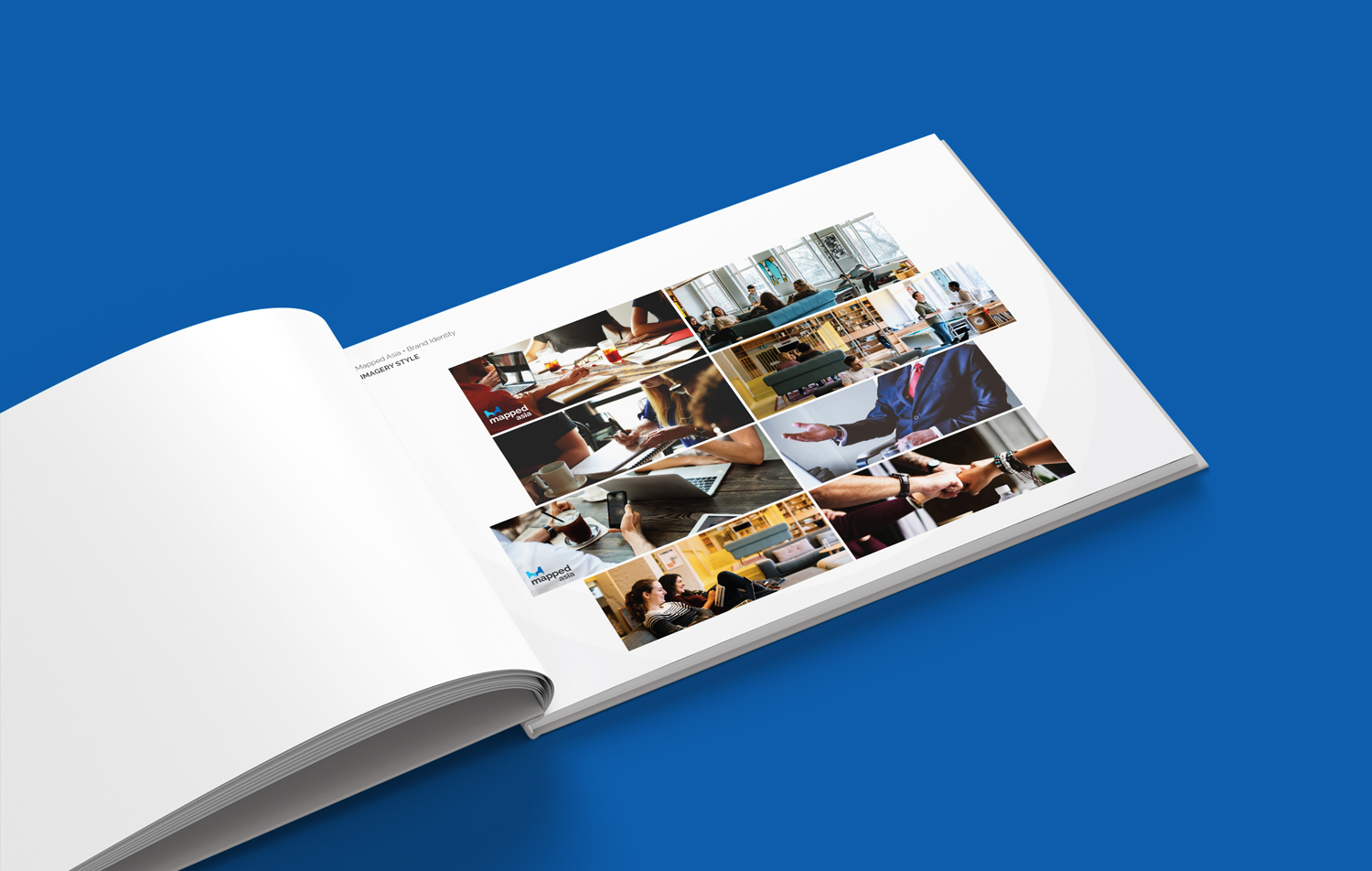
The style of imagery is warm, approachable and friendly, distinguishing itself from other recruitment and mentorship platforms through young and vibrant shots rather than standard corporate stock imagery.
Although the key colour palette is in shades of blue to give a sense of expertise and professionalism, the supplementary palette is bright and youthful to create contrast.